Inside a CCAD drawing class: five unique perspectives
By Colleen Clark
This semester, I'm taking John Kortlander's Advanced Figure Drawing class. Figure drawing has always been one of my favorite activities, and it is necessary to take several levels of drawing if you are an Illustration major like me.
Typically, drawing classes are in this format: the model poses for a few 30-second to five-minute drawings to start, and then sits for a longer 40-minute to an hour-long pose. The short drawings, or gesture drawings, are meant to warm us up to drawing and start quickening our pace. The faster you get the very basic lines of the body down, the sooner you can start refining your drawing.
My favorite thing about taking studio drawing classes isn't just the ability to practice drawing something I love, but also that I get to see my peers' art come to life right in front of me. I can look to the person next to me and immediately see how unique their style is from mine. In this class in particular, we are almost all Illustration majors. Even though we are all taking the same classes, being taught in similar ways, and have the same amount of time to look at the model, every single person approaches their drawings differently.
I was interested in seeing these drawings next to each other, so I asked four of my classmates to share their drawings from the same hour-long session with me. Flip through the gallery below to see each drawing and the artist's name in the caption.
For my drawing, I decided to try digitally painting from life. This is the main difference between an advanced drawing course and an introductory course; when you're just starting out, you typically use more traditional materials. Because I was using my computer and my drawing tablet, I got to really experiment with what colors I wanted to use. After my drawing was done, I adjusted the colors a bit to make them more saturated.
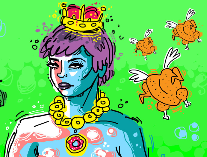
Kylie Jenkins (Illustration, Class of 2014) has notoriously hilarious class drawings. The stuff she sees in an every day pose is seriously out of this world. She added a burger money staff, a donut necklace, and little flying rotisserie chicken cherubs to the model's pose (I promise these things weren't actually in the room). Her typical process in class is to first draw the model's pose accurately yet still stylistically, and then make it into a goofy illustration.

Detail from Kylie Jenkin's class drawing, complete with rotisserie cherubs.
Alissa Breakiron (Illustration, Class of 2014) is a talented painter. She has been working digitally in class as well, but she tends to use methods that mimic traditional paint. She layers color and shapes like paint. When asked to describe her process, she said, "I'll start with a 50 percent color fill and then add a new layer for the beginning sketch and work from there. Sometimes I even go for a reduction process with digital or even start black and white then add color with a new 'multiply' layer."
Mellisa Stepp (Illustration, Class of 2015) is an illustrator with a knack for nailing down expression and a beautiful gesture in a few simple lines. She described her process for her watercolor drawing as "mostly experimenting using minimal detail, colors, strokes, and a simple sketch." Mellisa managed to capture the model's appearance and pose in a simplistic style.
Daniel Dufford (Illustration, Class of 2014) has a gifted eye for value and shapes. A lot of his conceptual illustrations are so strong because of his understanding of interesting silhouettes. He described his process to me: "When I paint, I not only try to paint the shapes that are in front of me, but I try to keep in mind how these planes are working in space and how one plane leads into another." Daniel also went in after class and added color to his digital portrait.
What I love about seeing these drawings together is how well they reflect each artist's style and outlook. Because I am familiar with these artists, I instantly know the artist when I see one of their drawings.
If you are ever worried about losing your individuality in art school, I hope seeing these immensely different drawings of the exact same thing eases your fears! Come, draw, and be as unique as possible.
Colleen Clark is a CCAD senior majoring in Illustration who wishes Star Trek was real. She loves comics, puppies, anything involving Tina Fey, and sharing her art and thoughts through her online blog.