Letter Portraits explores evolution of typography
Graphic design students tend to pick fonts based on novelty—what looks cool—rather than considering which typeface is most appropriate or legible, says Columbus College of Art & Design Advertising & Graphic Design Adjunct Faculty Oscar Fernández. Helping young designers learn to become more critical and discerning when selecting typefaces was a central objective behind Letter Portraits, a new short-run book project spearheaded by Fernández.
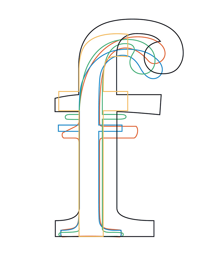
The idea for the project was born this spring, when Oscar Fernández taught the same typography course content at two schools, CCAD and Ohio University. As a collaborative project between graphic design students at CCAD and OU, the book explores the anatomy and the historic evolutionary journey of letters within the Latin alphabet.
Fernández assigned each student a letter, numeral, or special character, and asked them to analyze its anatomy and historic design changes. For the 60-page bound book, each student produced one single page illustrating the evolution of the letterform over 500 years.
“I hope students gained awareness, a passion, and professional pride in being graphic designers,” Fernández says. “Typography is graphic design’s core foundation. By learning and mastering important typographic skills, they are becoming the ‘quiet conservators’ for humankind’s greatest invention—writing.”
The book highlights the aesthetic differences between historical periods, Fernández says, from the calligraphy-inspired Old Style typefaces of the Renaissance to the bold, arrogant Egyptian typeface families of the Victorian period.
Copies of Letter Portraits are available at the libraries at both CCAD and Ohio University as a research reference tool as well as public access and viewing.
Learn more about Advertising & Graphic Design at CCAD or apply here.
Post date
August 23, 2019